Time-Series Analytics
It is a continuous sequence of different data points that are repeatedly measured from the same point and arranged in chronological order.
Time-series analytics transforms the traditional updating and overwriting of data into a real-time recording of each data point.
It is currently used in a wide range of functional scenarios on the Akila platform, such as asset operations, energy, HVAC systems, and indoor environmental quality (IEQ) sensors.
You can use it to:
- Create a basis for comparative analysis and transform data into relevant KPIs and indicators.
- Track minute-by-minute temperature and other data such as cloud cover, precipitation, wind speed, etc., to paint a more detailed and complete picture of our operations and identify more opportunities for optimization.
- Make the data changes more visible.
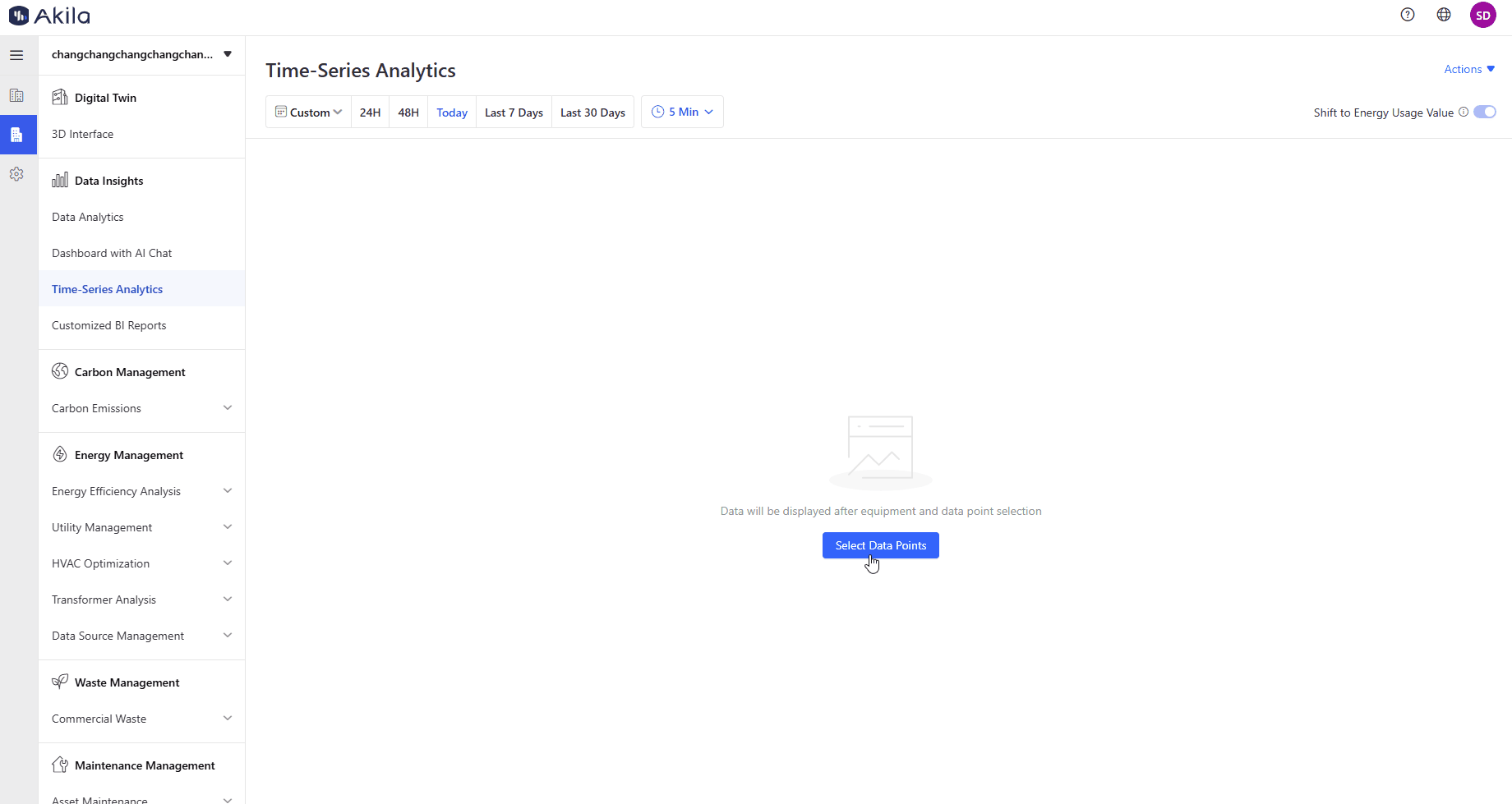
View Data
Preconditions: Finished all process of matching the data points on site with data points in Akila. You can contact Akila solution team to help you finish the process.
- Click "Select Data Points" on the middle of the page
- Select Raw or Calculated Data Points.
Note: Raw data point is equipment-related metrics. Calculated data point is processed raw data point. - Select time range and interval
Note: If time range <= 48H, you can select at most 50 data points; If 48H < time range <= 30 days, you can select at most 30 data points; If 30D < time range <= 90 days, you can select at most 20 data points; If time range > 90 days, you can select at most 10 data points; - Display a "Level Chart" for the points with status values.Line graph for calculated values and instantaneous values.
- Display Rule: All data points will be displayed by data point description. For example: If description 001 has generated data for five different equipments, then the five equipment data point will be displayed in one chart under description 001.
- Display Order: If you select 5 data point description, the hover chart will also follow the order.
- Basic Operations
| Operations | Description |
|---|---|
| Time Dragger | You can drag the time dragger over a selected time range to view data over a range of periods. |
| Time Interval | When viewing data on the Time Series page, you can also compare data from different points at the same time interval. Since data is not available for every point in time, you can view point data for every 5 minutes, 15 minutes, 30 minutes and 1 hour. |
| Shift Time Interval | When the selected time range is too large, the time interval will be automatically switched. There will be marks on the chart when the time range filter is within 48 hours.In this way, you can find data more quickly. |
| Shift to Energy Usage Value | You can view the usage data of the preset calculated data points. Now we have two types including raw data and usage data, so that you can understand Akila's ability to process the source data and statistics. |
| Hover | Move the mouse within the chart to view point data for the same time interval in different time range, while the hover will have vertical lines connecting multiple charts. You need to click the hover pop up and then it will be fixed. |
| Download Report | You can download what you set in this page. |
Quick Filter
- After selecting some filters
Note: Time period, time interval, shift to energy usage value and data point will be saved. - Click "Actions" on the top right corner
- Click "Add Quick Filter"
- Input the quick filter name.
- Click "Save".
Note: You can only add up to 10 quick filters. - Show on the left query part.
Note: If you have added multiple filters, you can switch between them to view the data of equipment data points in different views. Then you can also click "Edit" on the top right corner to remove it or rename it.